
Pie chart
Updated: 10/02/2017 by Computer Hope
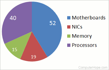
A pie chart is a circular chart that is sliced into sections (similar to slicing a pie you would eat), each section represents a percentage. The pie chart shown here represents a quantity of computer hardware. It visually expresses the relative numbers of parts are in stock, and what may need to be ordered or replaced.
Our pie chart example is made even easier to understand by the addition of labels to each of the sections of the pie chart.