
Column chart
Updated: 02/07/2022 by Computer Hope
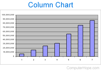
A column chart is a graphic representation of data. Column charts display vertical bars going across the chart horizontally, with the values axis displayed on the left side of the chart. The picture below is an example of a column chart displaying the unique visitors Computer Hope has received between the years of 2000 and 2006. As seen in this example, you can immediately see a gentle increase of users without reading any data.
Column charts and other charts are often created in spreadsheet programs, like Microsoft Excel or OpenOffice Calc. Column charts can display various data, such as sales trends, stock price changes, and precipitation amounts by year.