How to create a holy grail website layout using CSS Grid
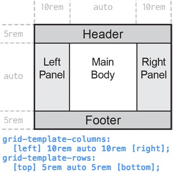
The following instructions describe how to implement the holy grail layout with CSS Grid.
Basic setup
Create a minimal HTML document. In a text or html editor, insert the following code.
Minimal HTML
<!DOCTYPE html>
<html lang="en">
  <head>
    <meta charset="utf-8">
    <title>Title</title>
  </head>
  <body>
    Hello, world
  </body>
</html>
Save the file as index.html.
Open index.html in a web browser. To open the file in a new web browser tab, press Ctrl+O (Command+O on macOS), then select index.html. You can also drag-and-drop index.html onto a browser window.

Minimal CSS
Create a new text file. In the empty file, add the following code.
html {
  width: 100%;                    /* 100% width of parent (root) element */
  height: 100vh;                  /* 100% height of viewport */
  background: rgb(0, 0, 0, 0.1);  /* 10% opacity black (very light gray) */
  font-size: 1.0em;               /* root font size */
}
body {
  margin: 0;                      /* no margin at edge of content */
  height: 100%;                   /* 100% height of parent (html) element */
}
Save this style sheet as index.css in the same location as index.html.
The width of the html element is defined as 100% (of available horizontal space), to account for the possibility of a displayed vertical scroll bar. If the html element is 100vw (100% of the viewport width), page content can extend under, and be concealed by, the vertical scroll bar.
In index.html, add the following line in the <head> element.
<link rel="stylesheet" href="index.css">
For example:
<!DOCTYPE html>
<html lang="en">
  <head>
    <meta charset="utf-8">
    <title>Title</title>
    <link rel="stylesheet" href="index.css">
  </head>
  <body>
    Hello, world
  </body>
</html>
Reload index.html in the browser. Notice that the background is light gray, and the content "Hello, world" touches the top-left edge of the viewport.

Define the grid
Add the following lines to index.css.
Grid container CSS
div.container {
  display: grid;
  width: 100%;
  height: 100%;
  grid-template-columns: 1fr 2fr 1fr;
  grid-template-rows: 1fr 3fr 1fr;
  grid-template-areas:
    "head head head"
    "panleft mainbody panright"
    "foot foot foot";
}
The grid container is the parent element of the grid. Its attributes apply to the entire grid.
The following describes the grid container styles used here.
| CSS | Description |
|---|---|
| div.container { style...} | Apply the styles listed between the brackets to any <div> elements in the HTML (HyperText Markup Language) that have the container class, for example: <div class="container ..."> The class name container is arbitrary. |
| display: grid; | Set this element as the parent of a new grid. All items in the grid are displayed in the box boundary of this element. |
| width: 100%; height: 100%; |
Set the box boundary of the element to 100% of the width and height of the parent element (<body>). |
| grid-template-columns: 1fr 2fr 1fr; grid-template-rows: 1fr 3fr 1fr; |
Define the grid's three default column widths, left to right, and three default row heights, top to bottom. The unit fr ("fractional unit") is special to CSS Grid elements. The value of fr is calculated as the width of the grid (for columns), or the height (for rows), divided by the total fr units requested. For example, in a grid 300 pixels wide with three columns defined as 1fr, 2fr, and 3fr, the column widths are are 50, 100, and 150 pixels. A column of nfr is always n times wider than a 1fr column. In this layout, the center element (the main body) is double the width (2fr) of each panel, and triple the height (3fr) of the header and footer. The panels are 1/(1+2+1)=1/4 the grid width. The header and footer are 1/(1+3+1)=1/5 of the grid height. |
| grid-template-areas: "head head head" "panleft mainbody panright" "foot foot foot"; |
The grid-template-areas attribute consists of a series of double-quoted strings, one for each row of the grid. Each string contains one word per column in the grid. Each word is the name of the grid area that occupies that cell in the grid. If a name is repeated, the named area spans those cells in the grid. Spanned cells must form a rectangle. Our CSS (Cascading Style Sheets) code says, "all three cells in the first row make up the head grid area. The next row has an area named panleft in the left column, mainbody in the center column, and panright in the right column. All three cells of the bottom row make up the area named foot." Note that the strings are delimited by a space or newline, not a comma. |
Grid item CSS
Each grid item occupies a named grid area. A grid area is one or more adjacent cells that form a rectangle, as named in the grid container template.
The holy grail layout has five grid areas: the header (area head), left panel (area panleft), main body (area mainbody), right panel (area panright), and footer (area foot). Add the following lines to index.css at the end of the file.
div.header {
  background: rgb(0, 0, 0, 0.2);                             /* 20% black */
  grid-area: head;                /* head corresponds to name in template */
}
div.footer {
  background: rgb(0, 0, 0, 0.2);
  grid-area: foot;
}
div.panel {                            /* div elements with "panel" class */
  background: rgb(0, 0, 0, 0.1);                             /* 10% black */
}
div.panel.left {                    /* with both "panel" and "left" class */
  grid-area: panleft;
}
div.panel.right {
  grid-area: panright;
}
div.mainbody {
  grid-area: mainbody;
}
Save index.css.
Grid HTML elements
Add five <div> elements in the HTML, in the <body> element, corresponding to the five grid areas.
  <body>
    <div class="container">
      <div class="header">Header</div>
      <div class="panel left">Left panel</div>
      <div class="mainbody">Main body</div>
      <div class="panel right">Right panel</div>
      <div class="footer">Footer</div>
    </div>
  </body>
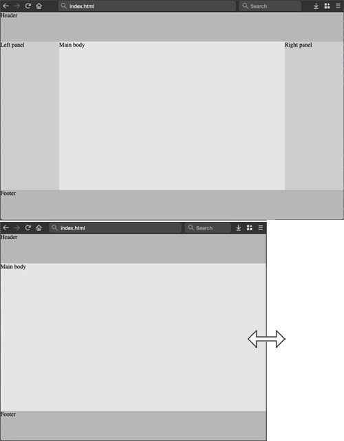
Save index.html. Reload index.html in the browser to test the grid.
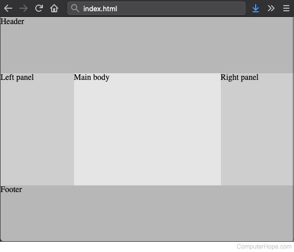
Resize the browser window, and the proportions of the grid adapt to the window size.
Set size of grid areas
Assign a height to the header and footer, and a width to the panels.
Open index.css and find these two lines.
grid-template-columns: 1fr 2fr 1fr;
grid-template-rows: 1fr 3fr 1fr;
Replace them with the following lines:
  grid-template-columns: 10rem auto 10rem;
  grid-template-rows: 5rem auto 5rem;
Save index.css.
The default width of the side panels is now 10rem, and the default height of the header and footer is 5rem. The main body (the center grid area) is set to auto, meaning the dimensions occupy all available space.
The rem unit ("root em") is based on the root font size of the document. In this example, it is defined in index.css, in the html element style:
html {
  ...
  font-size: 1.0em;
The rem unit equals this em value. For example, html { font-size: 1.2em; } would scale all sizes expressed in rem by 120% of their default value.
The exact size of the em unit depends on the font. As a general rule of thumb, 1em is equivalent to 16 pixels.
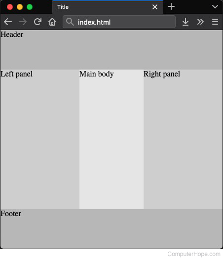
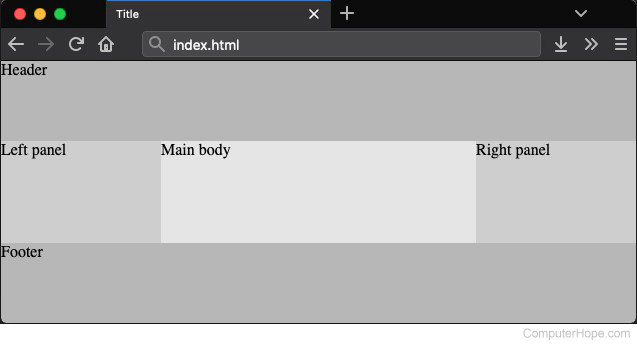
Reload index.html in the browser, and resize the window. The header and footer remain a fixed height, and the panels remain a fixed width.
Set mobile scaling
Modern web pages should be designed mobile first, meaning the design should prioritize how they look on mobile devices.
Using browser developer tools, the document can be viewed as if on a mobile device.
In Chrome, press Ctrl+Shift+I, and click the Toggle device toolbar button.
In Firefox, press Ctrl+Shift+M to open Responsive Design Mode.
By default, the scaling is small on mobile.
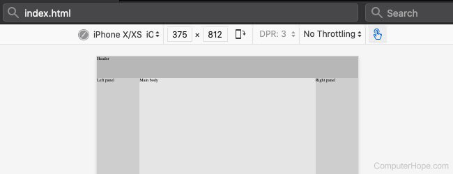
To make the text legible on mobile devices, add this line in the <head> element of index.html.
<meta name="viewport" content="width=device-width, initial-scale=1">
This line tells the browser to adjust the scale according to the device viewing the page.
Reload the mobile preview.
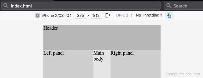
The scaled text is more legible, consistent with a desktop browser.
However, there is a new problem. The fixed-width panels are "squishing" the main body. In portrait mode on a mobile device, there's no room for panels. The steps in the following sections resolve this problem.
Make it responsive
When defining the grid template, names can be assigned to the grid lines.
Grid lines form the boundaries of each row and column, including the edge of the grid. A grid with x columns and y rows has x+1 column lines, y+1 row lines, and x+y+2 total grid lines.
Currently, our grid looks like the following diagram.
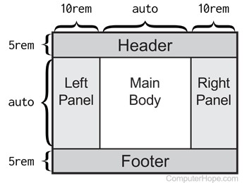
The grid contains three columns, defined by their column sizes.
grid-template-columns: 10rem auto 10rem;
Optionally, this definition can also contain line names.
Assign grid line names
In the template definition, line names are enclosed in brackets. They can be specified before, between, or after a size value.
In index.css, change the value of grid-template-columns to the following.
grid-template-columns: [left] 10rem auto 10rem [right];
The names left and right now refer to the vertical boundary lines of the grid.
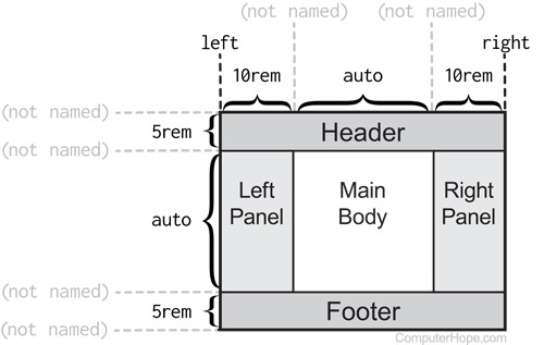
These names can redefine the edge of a grid area, as described in the next section.
Conditional CSS with a media query
A media query is a conditional CSS block created with the @media CSS keyword. The styles in a @media block are applied only when specified conditions about the viewing device are true.
Media queries can apply styles based on the viewport size, so if the user resizes their browser window or rotates their phone, the CSS responds accordingly.
The general form of a media query is:
@media media-type and (media-feature-rule) {
  style ...
}
Add the following media query to the end of index.css.
@media screen and (max-width: 50rem) {     /* if viewport width < 50rem */
  div.panel.left {
    grid-column-end: left;            /* left panel stops at left edge */
  }
  div.panel.right {
    grid-column-start: right;         /* right panel starts at right edge */
  }
  div.panel {
    display: none;                    /* neither panel is displayed */
  }
  div.mainbody {
    grid-column-start: left;          /* mainbody starts at left edge */
    grid-column-end: right;           /* mainbody ends at right edge */
  }
}
Save index.css. Reload index.html in the browser, and resize the window. When the window becomes narrower than 50rem (approximately 800 pixels), the panels disappear, and the main body expands to span all three columns.
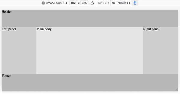
On mobile devices, the panels are displayed only in landscape mode.
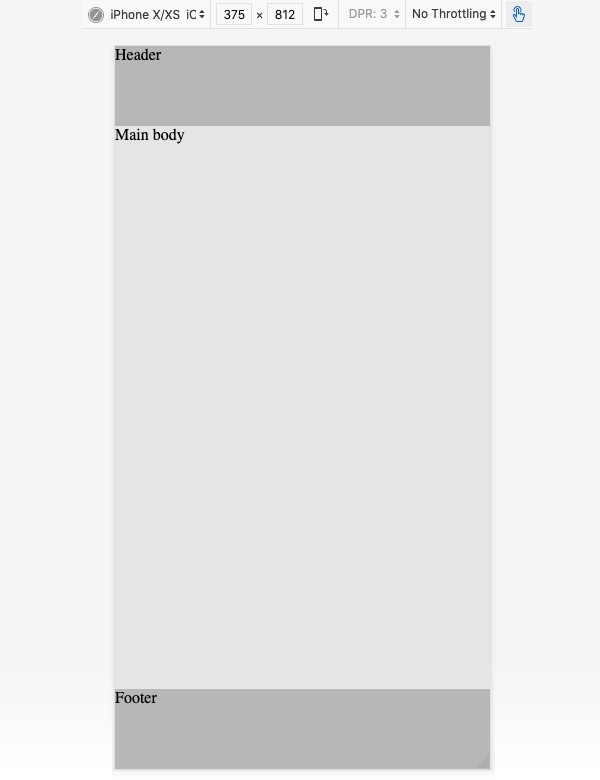
When the mobile device is rotated to portrait mode, the panels are hidden, and the main body spans the width of the device.
Final CSS and HTML
The final CSS adds three additional features.
- The grid container has a minimum height, preventing the footer and header from fully collapsing.
- The width of the mainbody element is fixed, preventing body content from reflowing.
- The mainbody element is center-justified in its grid area.
Final index.css
html {
  width: 100%;                    /* 100% width of parent (root) element */
  height: 100vh;                  /* 100% height of viewport */
  background: rgb(0, 0, 0, 0.1);  /* 10% opacity black (very light gray) */
  font-size: 1.0em;               /* our root font size */
}
body {
  margin: 0;                      /* content goes to edge of viewport */
  height: 100vh;                  /* and spans height of viewport */
}
div.container {
  min-height: 25rem;            /* mainbody height never squishes < 25rem */
  display: grid;
  width: 100%;
  height: 100%;
  grid-template-columns:
    [left] 10rem auto 10rem [right];
  grid-template-rows:
    [top] 5rem auto 5rem [bottom];
  grid-template-areas:
    "head head head"
    "panleft mainbody panright"
    "foot foot foot";
}
div.header {
  background: rgb(0, 0, 0, 0.2);                             /* 20% black */
  grid-area: head;                /* head corresponds to name in template */
}
div.footer {
  background: rgb(0, 0, 0, 0.2);
  grid-area: foot;
}
div.panel {                            /* div elements with "panel" class */
  background: rgb(0, 0, 0, 0.1);                             /* 10% black */
}
div.panel.left {                    /* with both "panel" and "left" class */
  grid-area: panleft;
}
div.panel.right {
  grid-area: panright;
}
div.mainbody {
  grid-area: mainbody;
  width: 30rem;                   /* mainbody width is fixed */ justify-self: center;           /* and always centered in grid area */
}
@media screen and (max-width: 50rem) {     /* if viewport width < 50rem */
  div.panel.left {
    grid-column-end: left;            /* left panel stops at left edge */
  }
  div.panel.right {
    grid-column-start: right;         /* right panel starts at right edge */
  }
  div.panel {
    display: none;                    /* neither panel is displayed */
  }
  div.mainbody {
    grid-column-start: left;          /* mainbody starts at left edge */
    grid-column-end: right;           /* mainbody ends at right edge */
  }
}
Final index.html
<!DOCTYPE html>
<html lang="en">
  <head>
    <meta name="viewport" content="width=device-width, initial-scale=1">
    <meta charset="utf-8">
    <title>Title</title>
    <link rel="stylesheet" href="index.css">
  </head>
  <body>
    <div class="container">
      <div class="header">Header</div>
      <div class="panel left">Left panel</div>
      <div class="mainbody">Main Body</div>
      <div class="panel right content">Right panel</div>
      <div class="footer">Footer</div>
    </div>
  </body>
</html>
